Carved Text from
Photoshop, (the
hard way)
or The wonders of the magic
bumpmap. ver 1.0
by Mathias Vejerslev.
This is
an intermediate to expert level Photoshop tutorial.
If stuck, please obtain advice through http://www.adobeforums.com,
the Photoshop Win forum.
Requirements:
Photoshop, ver 4+ (5.5+ for
Layer Effects)
Kai´s Power Tools 3.0 recommended
Optional downloads:
Plywood lighting
style (put it in your Photoshop folder under Plug-ins>Filters>Lighting
Styles and restart Photoshop)
Original Photoshop 6 file+sep. alpha+sep.
original texture (ZIP-file, 1,2MB. Original texture and alpha already
included in the plywood.psd file)
#1
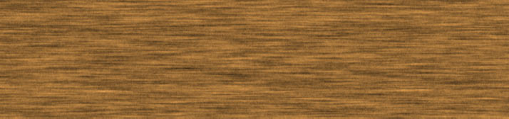
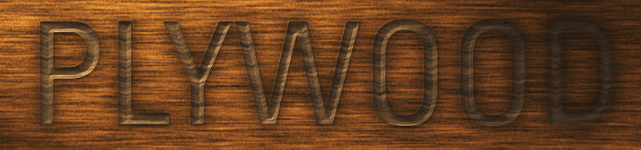
Open the texture in which you want to engrave type.
Here, I´ve created from scratch a fast, cheap, wood-like texture (plywoodtexture.psd),
714 x 168 pixels.
(Dimensions are important for this technique. I suggest you start out with a
similarly sized/cropped file for the sake of this tutorial.).
#2
It is very important to select a typeface that would naturally be used for
chiselled type.
(I didn´t care, so I used Univers 57 Condensed.)
Go on and set your type on that texture.
The type colour should be 50% black (H:0,S:0,B:50), @ 100% opacity.
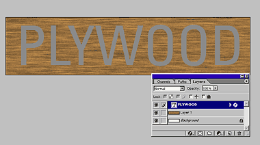
Put the Type Layer in Overlay Mode, and hide it by clicking its eye on the Layer Palette (although it´s already hidden by Overlay mode).
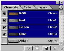
#3
Click over to the Channels Palette, create a new, empty Alpha Channel, and fill this new channel with 50% black (H:0,S:0,B:50).
Now go back to the Layer Palette, CTRL-click the Type Layer to make it a selection,
then return to your new Alpha Channel (be sure it is the only channel selected),
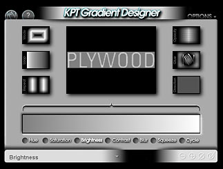
and , here comes the first trick, fire up Kai´s Power Tools 3; Gradient
Designer.
The Gradient Designer can do a variety of exciting gradients, among them is
the Circular Shapeburst gradient.
This gradient is perfect for creating a 'true' emboss effect.
Do I really need Kai´s Power Tools to do this?
Well, yes unfortunately. If there´s one reason to buy KPT 3.0, I´d
say the Gradient Designer is the one.
Unless you are super-skilled with alpha channels and gradients, you´d
really want the effect and control of the Circular Shapeburst for this
particular effect.
For this file, I´ve set it up as follows (this may vary from file to file, feel free to play around as long as you´ll reach somewhat the alpha we´re after (see below)):
Mode: Circular Shapeburst
Looping: B>A, Pinch Outwards
Repeat: 2 times
Opacity: 100%
Glue: Normal
Make sure the gradient is a black-to-white one.
(You select the colour in the gradient by clicking on it where you want the
change, then drag into the palette well fly-out to the colour you desire).
Now, click the Brightness control, and drag the mouse to the right, till
you reach 50% brightness.
What did we just do?: We raised the black end of the gradient to a maximum of
50% black, the base colour of our alpha channel.
This is what I see:
If you see this, it´s now safe to click OK. (V)
You should have created an alpha channel resembling somewhat this:

Notice the diamond shaped corners and how the gradient follows the shape of
the text?
This will make a really good base for our next step:
From the Channel Palette, click the little arrow, and select Duplicate Channel.
Duplicate the channel to a New file, and name the destination file 'alpha':
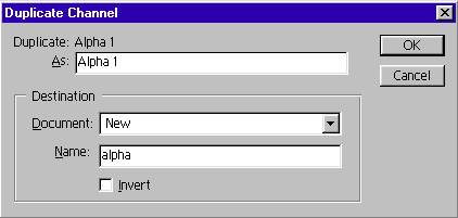
Click OK.
Now save this new file as alpha.psd to your harddrive (file>Save).
Since this alpha file is essentially a displacement map, I have a special folder
on my harddrive for all my displacement maps called 'dispmaps' in the root of
my D: drive. I´ve got quite a collection of textures. (Now you know).
After saving the file, you can safely close it. - Next time we will see it will be when we load it from within our main file.
Are you with me so far?
If you are, you must be quite a Photoshop wizard! Good job!!
You´re not with me? Well, start over!.
Now, back to our texture and all the fun stuff...
#5
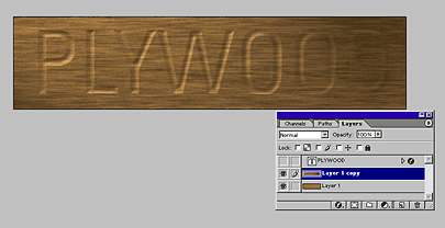
What we´ve got so far is a photoshop file with two layers;
The Texture Layer
the Type Layer,
+ one Alpha Channel.
(Oh, and the saved Displacement Map, ofcourse.)
To at least try to proceed non-destructively, we´ll do some backup the old-style way:
Duplicate the texture layer, so you have a backup of the original texture before proceeding.
On this duplicate of the texture, we´ll first apply the Lighting Effects, then we will distort the texture to achieve depth. I´ve found that by applying the lighting effects before you do the distortion creates a better, more eschewed effect. If you do the distortion first, you´ll achieve a en face effect, which is not so believable. Anyway, this is where you can experiment. If you do the the distortion first, (great for learning), jump to step #7 before proceeding with step #6.
Filter>Render>Lighting Effects. Ever been there before? It´s a really cool place to play with alpha channels.
You can either set up your own lighting here (recommended if you know about setting light), or, if you are duplicating my file size (714 x 168 pixels) you can download the style I used (put it in your Photoshop folder under Plug-ins>Filters>Lighting Styles and restart Photoshop). I recommend a 120 degree lightfall.
For Texture Channel, use our 'alpha 1', and make sure to un-check 'White is high'.
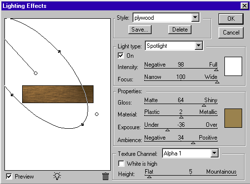
Just a basic lightscene.
Click OK.
The Lighting Effect part is a crucial step for this effect to work. You´ll normally need a few trial and errors before you get it right. If the first try doesn´t work out, just press Ctrl-Z and try again. Try adding more than one lightsource; try imagining from where all light in the scene comes from, and then place them in the interface one by one. Oh, and don´t go too high in 'Height'!!
Here´s what I got with two lightsources, a main spotlight and a subtle ambient blue omni light for 'backlight':
We are going for a subtle effect. A too powerful one will look fake.
Detail:
So, up until now, what we´ve created isn´t much. We could almost achieve the same thing with Photoshop 6´s Layer Effects, Bevel & Emboss, with the type layer we´ve already got. Nothing fancy about it. But we´ve literally only just scratched the surface!. HANG ON FOR #7!
Filter>Distort>Displace. Relativity theory. Einstein stuff. - Not really. Again, a place where alphas play.
Displace does just what it claims to do. It displaces in percentual values based on a Displacement Map (Of the kind we just saved as alpha.psd in step #4!).
A Displacement Map works like a Bumb Map; There´s 256 levels of grey
in it, white is higher, black is lower
(or, if you use negative numbers, white is lower, black is higher).
Fire it up. Settings will depend on your filesize, but if it´s anywhere near mine, and you want subtle too, go for small, negative numbers (negative because we want to create a convex impression).
I found these figures reasonable for my image dimensions:
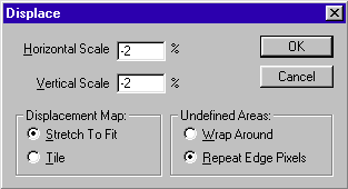
Click OK.
When it asks you for a file, select the previously saved alpha.psd.
(Important: the alpha and the main file must be exactly the same size
for the spell to work).
Again, if the first try doesn´t reveal the effect you are after, just
press Ctrl-Z and try another setting.
You remember when we dyed the alpha channel 50% black? Well, the displace command
is, as mentioned, based on grayscale levels, and 50% black is neutral ground.
So anything 50% black won´t be affected by this filter. If the background
was black, it would be heavily displaced, and we would need to crop the image
after we applied the effect.
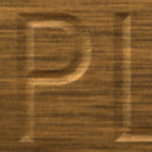
Detail:
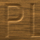
You see how we´ve now achieved 'bending' or embossing the wood texture
according to the saved alpha channel´s text / brightness values? The image
has also gained sort of a perspective, since it now seems more like we are looking
from lower right.
Very nice.
Now, the main part is over. Take a breather and pet your dog or cat for a minute. Personal thank you´s from me to you for following me thus far. It´s a rather old-style technique, but it can really come in handy in some cases. Don´t be afraid to dive into Photoshops intricate filters. They´re all there for a reason. (I think?).
#8
Now, although we have got the basics down, the effect is still not quite believable. We must play a few more strings (but it´s fun so to heck with it).
Turn on the original Type Layer (you won´t see it, because its
in Overlay Mode, 50% black), and double-click it to bring up the Layer Styles.
We want a sharper Inner Shadow as well as a soft Outer Shadow
to create a kind of 'used' look.
In general, one should never use 100% black for shadow colour. No shadow is
ever only black (unless in a strictly black/white environment obviously). I
chose a dark brown (hard to see on the examples) for both shadows.
Shadow settings:
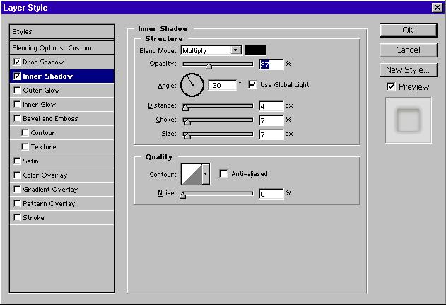
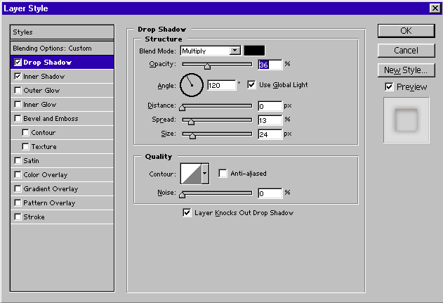
Nothing too strict about these settings. I basically played around till I reached
something acceptable.
The thing to note is the angle of attack of the inner shadow; 120 degrees, because
that is where my Lighting Effect comes from.
After applying the shadows, CTRL-click the Text Layer again to make it a selection,
and from this, create a new Hue/Saturation Adjustment Layer. I chose
to just lower the Saturation in this case.
A final Edit>Copy Merged, Paste, Unsharp Mask and a Curves Adjustment Layer, and we are done! (sort of, for now):
---------------- Finish line!! ----------------
That was not too hard was it?
What is so special about this technique, I hear you ask?
Well, you ACTUALLY carved the text, remember? It´s not 'fake'. You carved it with the Distort>Displace and the Render>Lighting Effects, with your alpha channel as a template. With minute control over the end result. - With a little practice, you can do a lot better than I did in this tutorial.
Apart from the direct visual effect of it on text, this technique can be applied to any bumpmap/alpha on any background/texture for 'instant' proofing before taking it to a 3D program.
I wish you good luck and much fun experimenting!
'The power is in the alpha channel'.
Did you make it? Did you have fun? Was it worth it? Did I make it writing the
tutorial?
Please let me know through the Adobe
PS win U2U forum.
Please, no e-mail support on this one...
Ooops. Lesson is over, kids. My mother is throwing a birthday party!
Good luck!
Variations of this technique (by me):

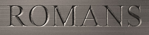
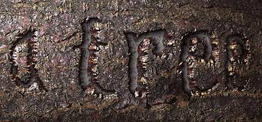 detail:
Mathias Vejerslev
mvejerslev@hotmail.com